Brand Identity
A brand identity system that communicates craftsmanship, warmth, and inclusivity while appealing to both locals and tourists who seek authenticity with a modern twist.
Key Words
Maltese TraditionModern Artisanal ApproachBrand Feel
Warm & ArtisanalFriendly & ApproachableModern Heritage
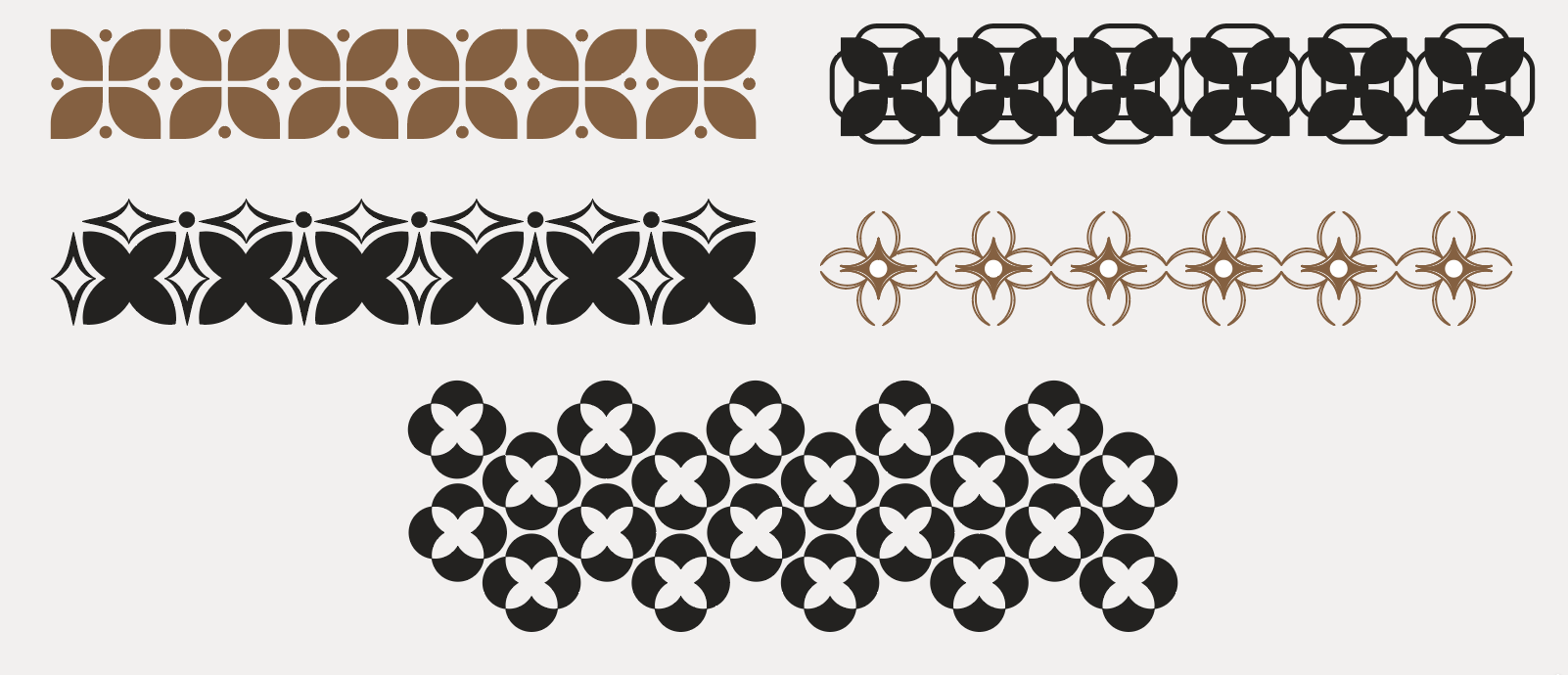
Identity
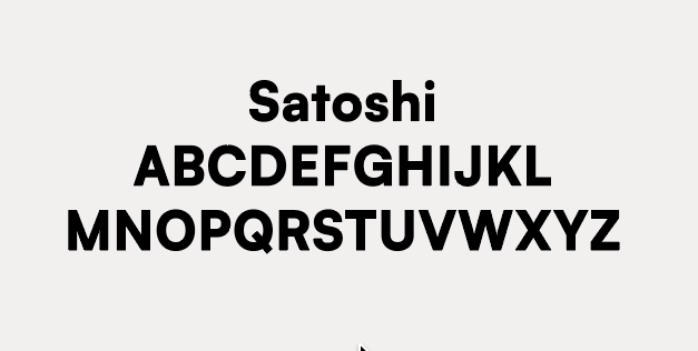
Typography
InkTrap Typeface was implemented due to its sophisticated character which complements malta’s heritage and reflects on the brand’s artisanal natureAudience
Locals who value traditionTourists seeking authentic, crafted productsYoung adults seeking artisanal, instagram worthy food spotsIcon
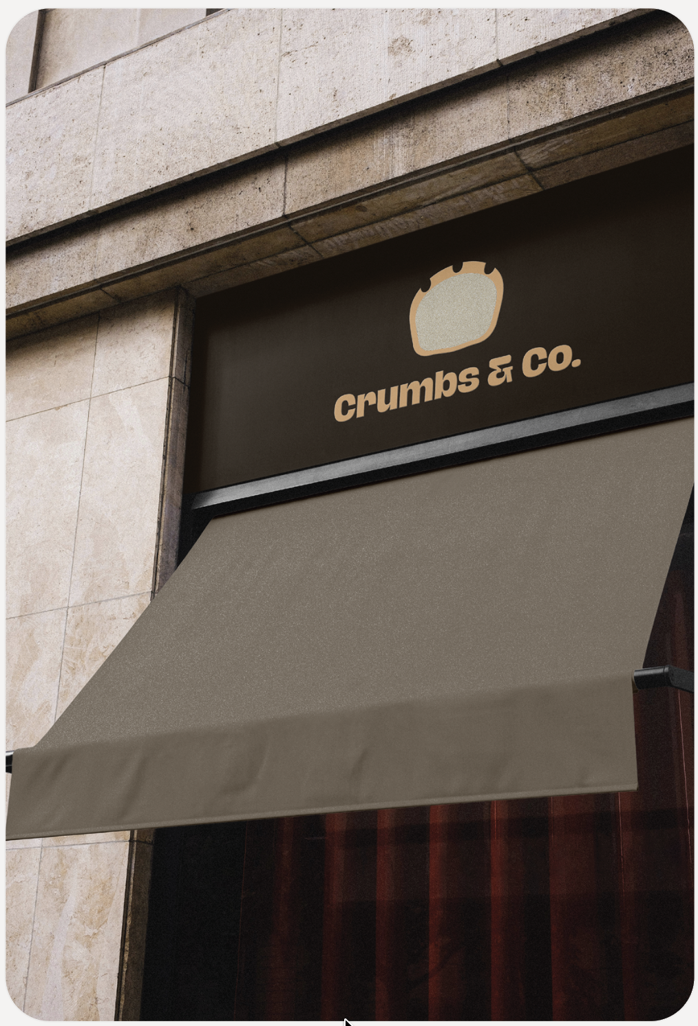
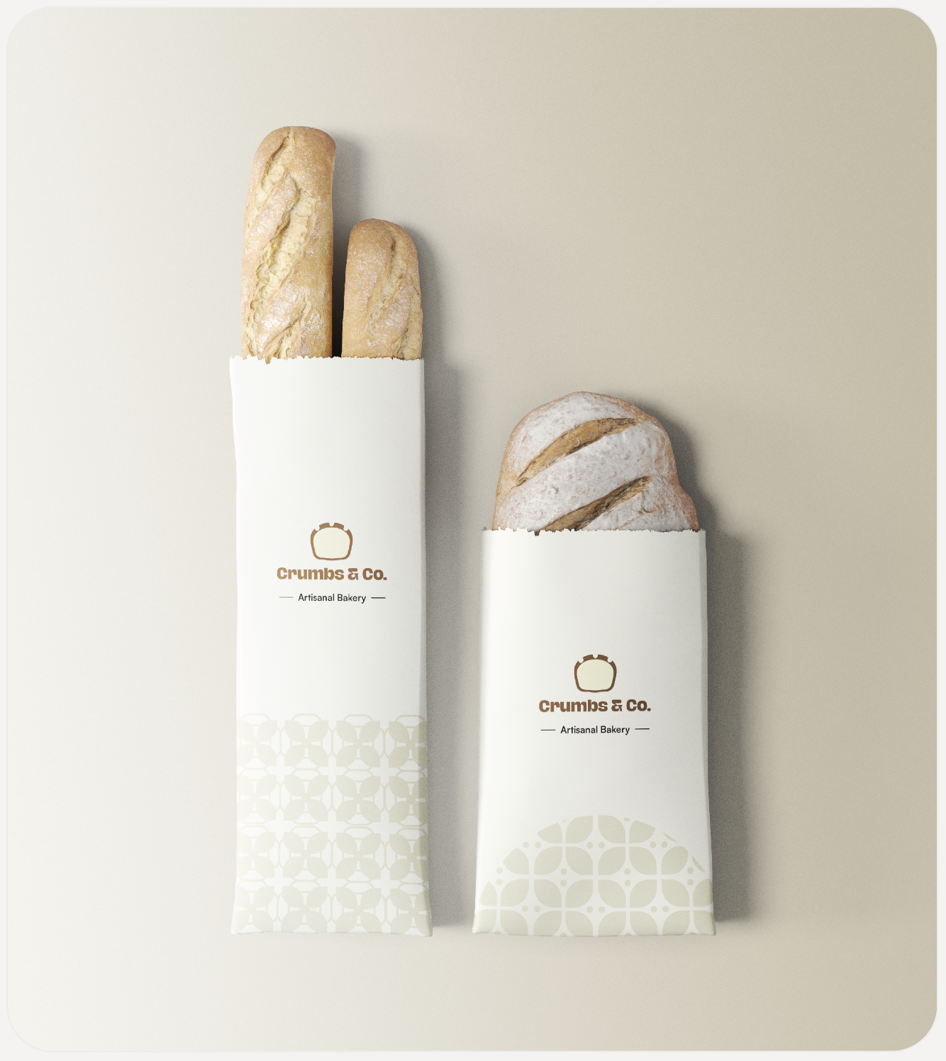
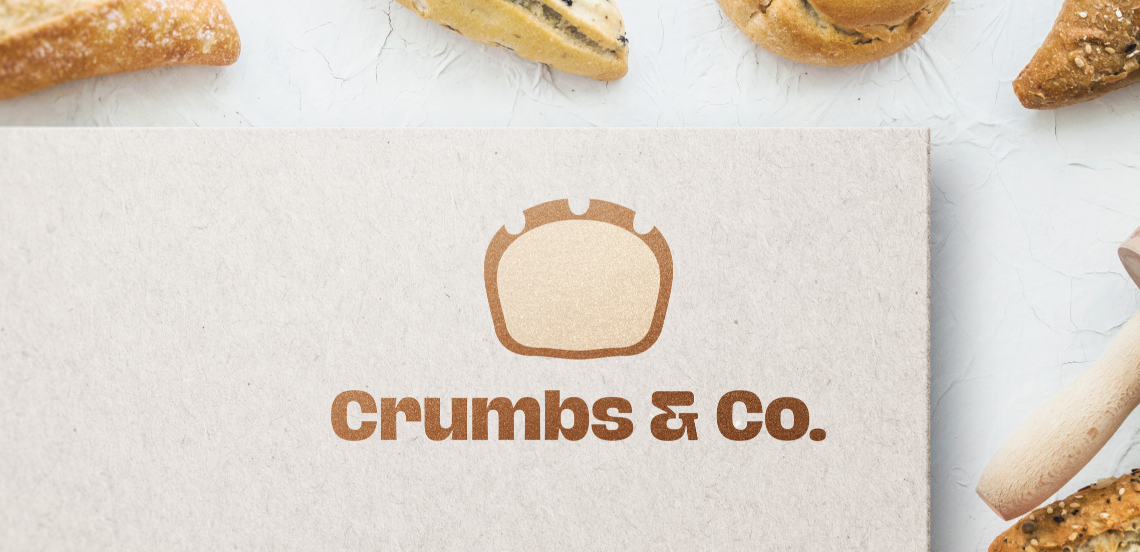
The iconic Ħobża tal-Malti was selected as the brand’s signature symbol, with a flat design chosen to reflect its modern, artisanal, and warm character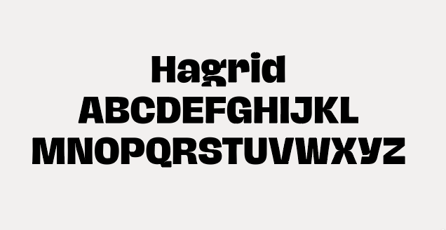
Together these elements form a brand system that emits a sense of sophistication, trust and approachability, which was what this brand was aiming for.